 |
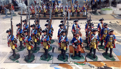
| Prussian Guard IR15/II battalion. Minden Miniatures. |
Yesterday I finished 22 figures - Minden Miniatures SYW Prussian Guards in tricorn hats (hence the 2nd battalion of the IR15 Guard Regiment). There was a point during the afternoon painting session where I could really feel the painting mojo coming back. The paint was flying off of my brushes.
 |
| Close up view of the figures painted so far. |
The figures are being painted as part of a painting challenge, set up by Major General Pettygree, for the month of January. I have to finish the total 32-figure unit by the end of this month. Participating in a painting challenge is a good way to get back into the painting groove.
I had a spare Prussian Zimmerman on hand, already primed, so I painted him as one of the Guards and will place him on the command stand when I get around to basing all of the figures.
The Color Palette Used
Here is a list of the paint colors that I have used on my Prussian Guards. The first color shown is the shade color and the second color is usually my highlight color. Sometimes I will use a third color in a triad, so where three colors are listed, the first color is the shade, the second color is the base, and the third color is the highlight.
Flesh tones:
Red Brown IWM 77-713
Rosy Shade Reaper 09067
Rosy Skin Reaper 09068
Yellow Breeches and Waistcoat:
Rucksack Tan P3 Paint 93062
Moldy Ochre P3 93063
Blue Coat:
Breonne Blue Reaper 09055
True Blue IWM 77-720
Red Facings:
Blood Red Reaper 09003
Fire Red Reaper 09004
Phoenix Red Reaper 09005
Black
I use various craft paints for the black and brown bits. Any item of equipment (gaitors, musket, hair, rucksack, etc) gets an undercoat of black paint. Then I paint the brown color over the black. I sometimes highlight brown colors, but recently I have decided that the musket barrel and fur pack look better without the highlights. I generally do not do highlights for black paint.
And it goes without saying that EVERY METALLIC COLOR should have a black undercoat or else the metal doesn't pop visually. For example, when you paint a button, paint it black first, and then dot the gold or silver or brass color on top of the black button.
Whites and Greys
I use craft paints for most of my grey tones and any pure white will look good. I use one of the P3 white colors. For cross belts, use a light grey undercoat and then apply the white paint over the grey. White on top of a darker grey doesn't look very good because the color contrast is too great.
If I want a dirty white color, such as for haversacks and waistcoats/breeches, I use a mid tone of grey as the base and then use the light grey as the highlight color.
Shading and Highlighting
I use a two-color shade & Highlight system for most of my colors (uniforms and brown equipment). Sometimes I will go with the now-traditional shade/base color/highlight triad system, but in my experience, add the third color doesn't give you much of a payback in the look of the finished figure.
Mixing Your Own Highlight Colors
Sometimes you just can't find a suitable second color or highlight for one of your colors. In this case, you will have to mix up your own paint forumula. Start with your base color, not the shade, and add in a lighter color for the highlight. I don't use white for everything though. I have found that a light tan is a good color to use for the highlight mixer. Regular white will turn your red into a pink and you don't want that to happen. Brown and orange make for a good looking brown highlight, as does the light tan. The red leather apron on the Prussian zimmerman figure was my own mix of the base red brown color with a small drop of light tan.


Lovely looking unit as always.
ReplyDeleteVery nice, what do prime with Jim.
ReplyDeleteI always use grey primer, unless I'm painting buildings or equipment.
DeleteThey look suitably Guard-like! I am sure they will perform magnificently!
ReplyDeleteThey look fantastic mate, great to hear you are out of the slump and your mojo is back
ReplyDeleteCheers
Matt
Yes. One of your prettiest units if I might be so bold. The mix of primary colors really does it. And what a lovely blue.
ReplyDeleteBest Regards,
Stokes
very nice Jim. It must be the podcasts you're listening that are improving the flow!
ReplyDeletedefinitely!
DeleteLovely and stately indeed.
ReplyDeleteBravo,
Bill P.
Chronicler for The Adventures of General Pettygree
Many Thanks for the shared this informative and interesting post with me.
ReplyDeleteGamesBx News | Juegos Poki | GamesBX relax